Brand Narrative and Identity Development

Lily's Donuts & Pops

Branding exercise for Lily’s Donuts and Pops seamlessly blends nostalgic coastal vibes and crafted treats.

Play Video

The Brand Amp was asked to assist the new QSR concept with weaving together its brand narrative and visual identity into a cohesive story that celebrates a nostalgic coastal vibe with craft donuts, coffee, beer, and pops.

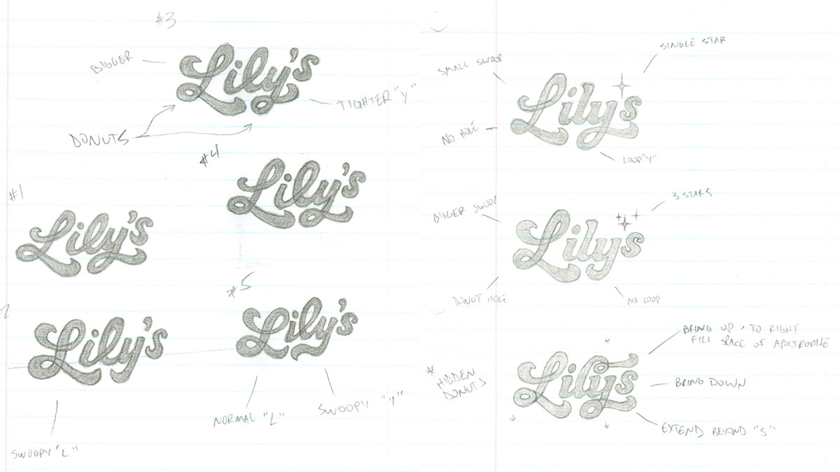
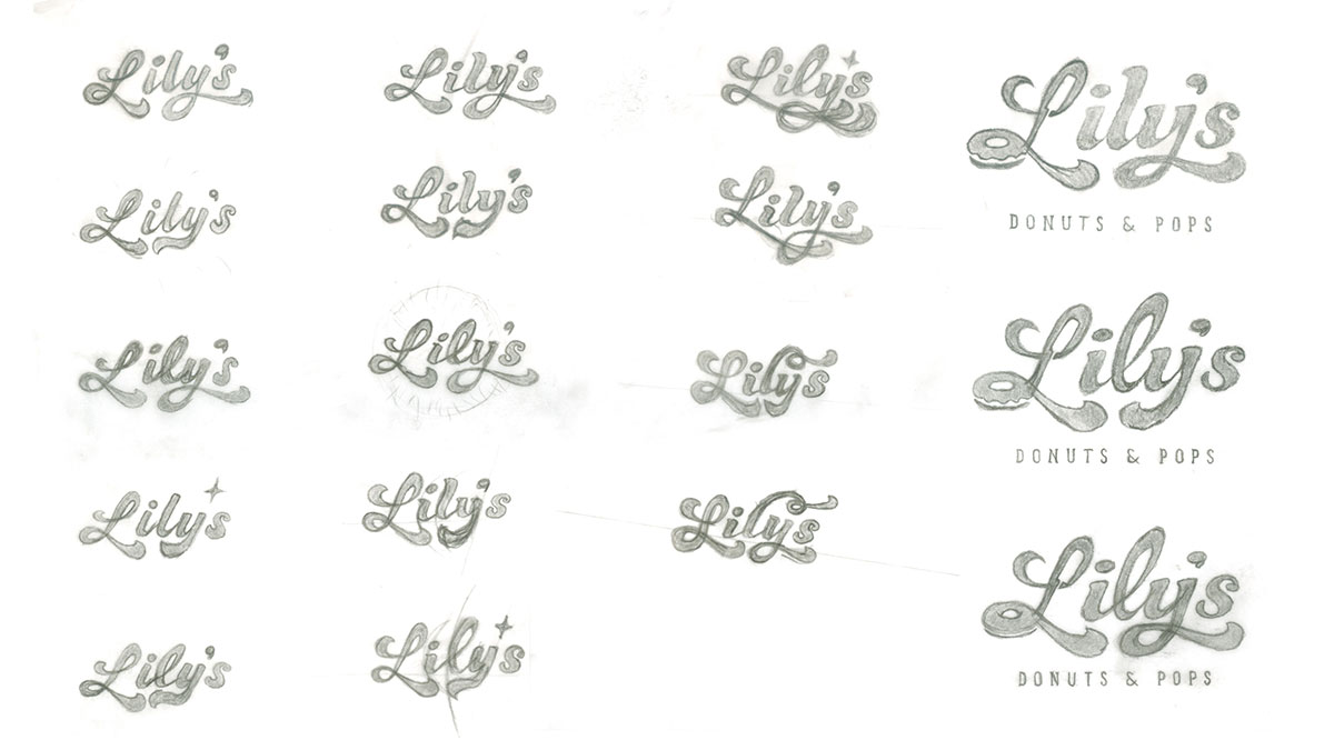
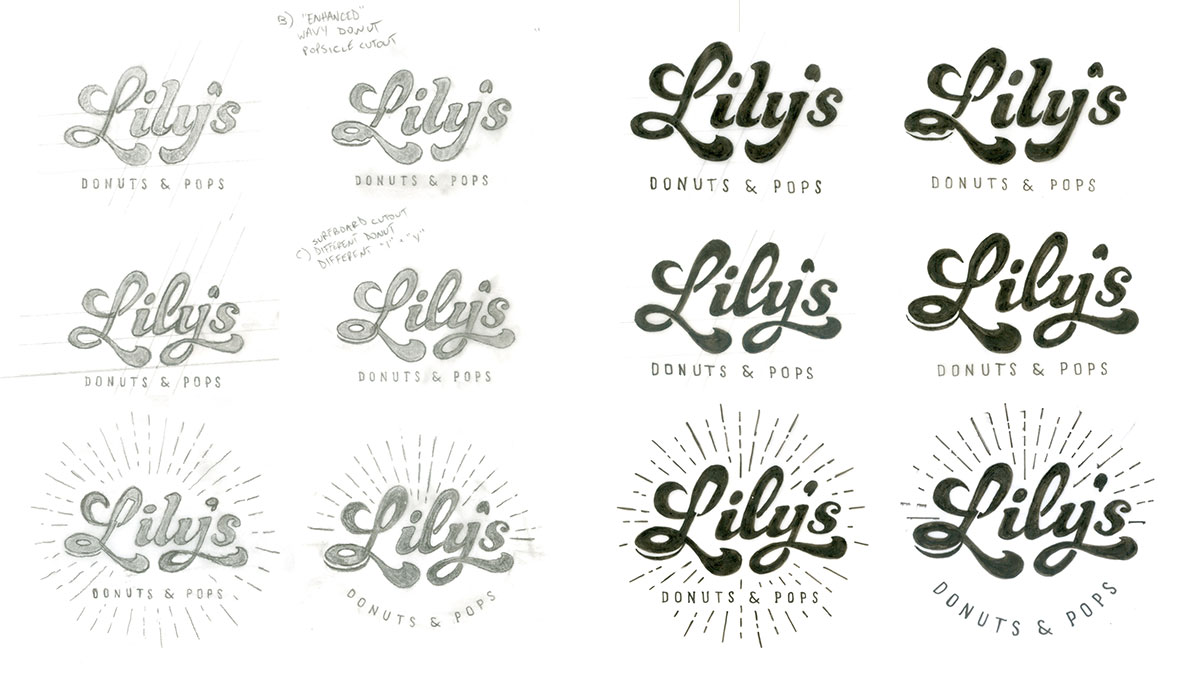
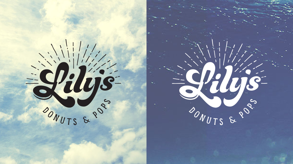
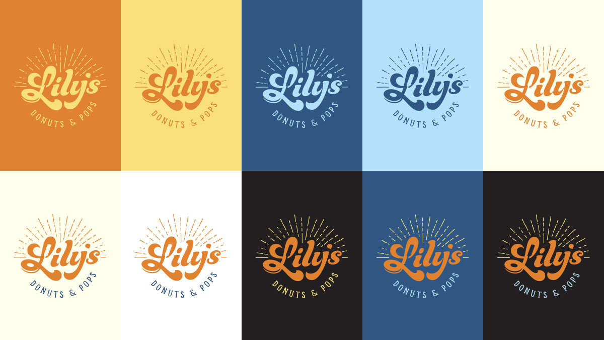
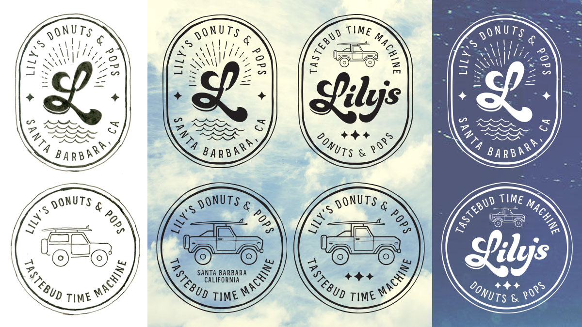
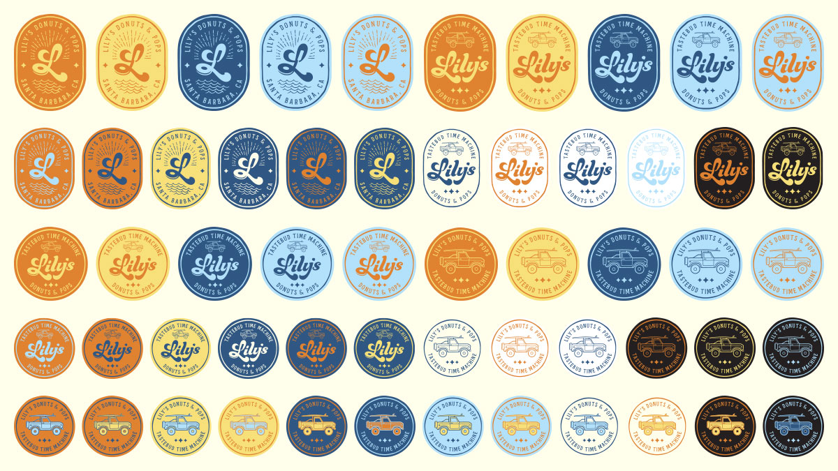
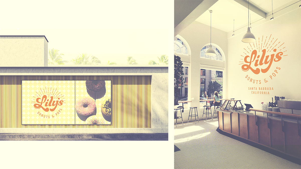
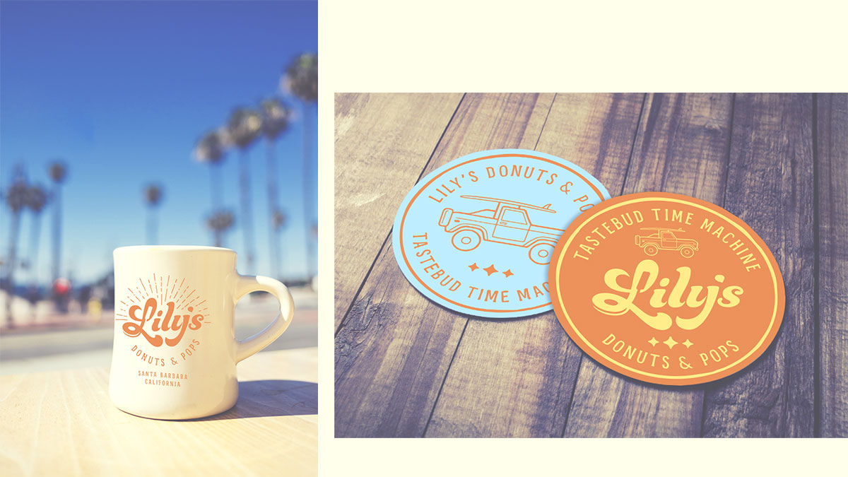
Leveraging the Lily’s brand narrative that shaped the brand’s purpose and story, the Design team developed the brand visual identity system that included their primary logo, secondary logos, brand colors and typography, pattern and photographic overlay development, and a comprehensive brand style guide outlining each of the visual components and their respective roles within the brand identity system.

Following a process that began with multiple rounds of hand-drawn concepts to define the primary brand logo, the Design team employed the same illustrative approach with the Lily’s secondary logomarks that produced an organic, distinctive look across the core brand elements. The selected brand colors were inspired by the paint colorways found on 1970s Ford Bronco trucks, with the brand typefaces strategically chosen to evoke a nostalgic, retro feel while preserving a modern aesthetic. Lastly, the brand style guide was developed to serve as the essential benchmark for Lily’s as the brand expands its presence digitally and through tangibles such as retail merchandise.